Led Zeppelin | Led Zeppelin
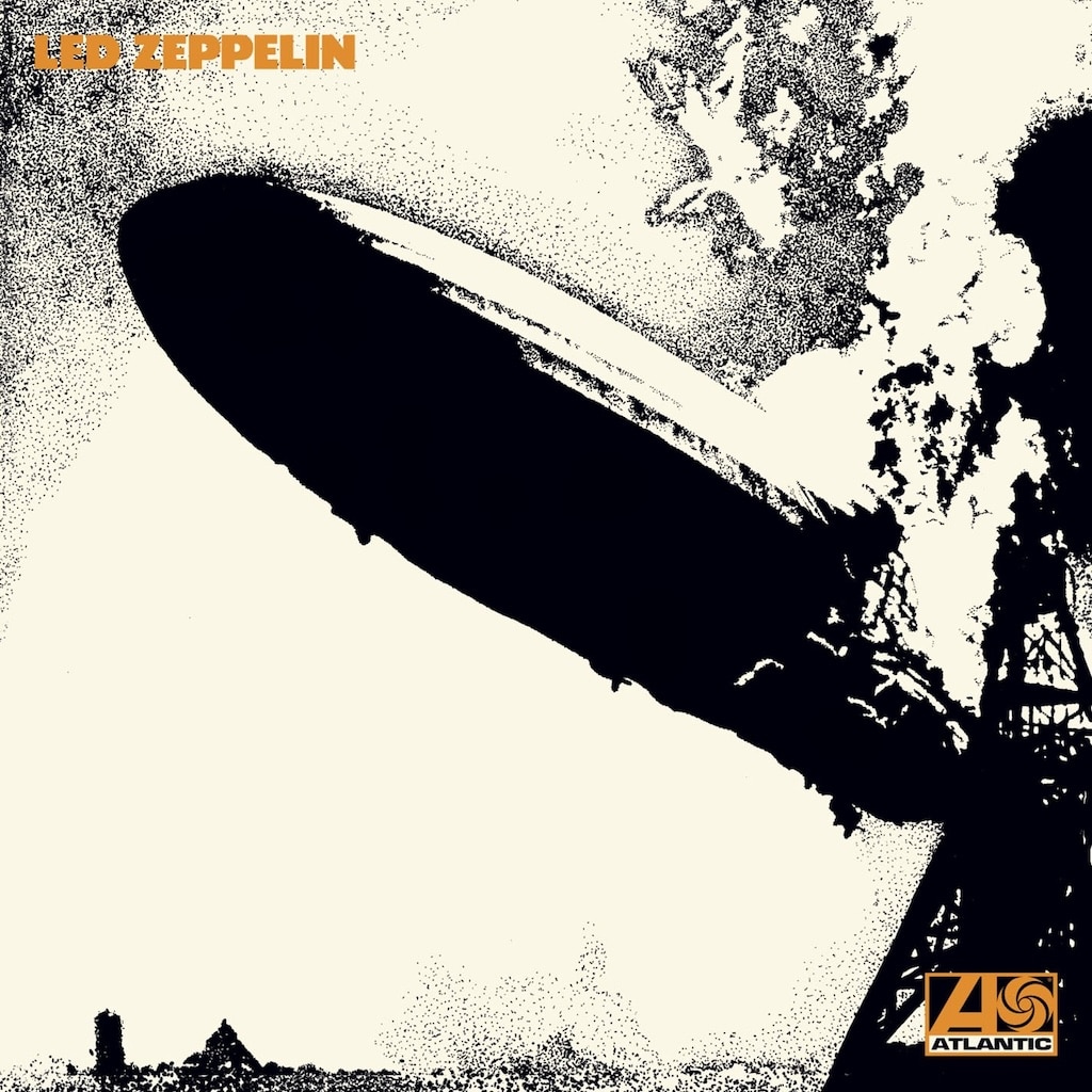
Led Zeppelin’s self-titled debut album, “Led Zeppelin,” released on January 12, 1969, is a mainstay of rock history, and its cover art is as bold and unforgettable as the music it introduced. The album’s iconic cover features a stark black-and-white image of the Hindenburg airship disaster, captured in a famous 1937 photograph by Sam Shere. The dirigible, engulfed in flames and plummeting to the ground, is rendered in high-contrast monochrome, creating a dramatic and almost surreal visual impact. This image, chosen by guitarist Jimmy Page, was both a literal nod to the band’s explosive name and a metaphor for the seismic impact they intended to make on the music scene.
The backstory of the cover art is rooted in the band’s desire to make a statement from the very beginning. Jimmy Page, who had recently left The Yardbirds, wanted the new group’s debut to stand out visually and sonically. The name “Led Zeppelin” itself was inspired by a joke from The Who’s Keith Moon, who quipped that the band would go down “like a lead balloon.” Page embraced the phrase, altering the spelling to “Led” to avoid mispronunciation, and paired it with the image of the Hindenburg disaster to create a powerful, ironic juxtaposition. The cover was designed by George Hardie, who transformed the original photograph into a stylised, almost abstract piece of pop art. The band’s name appears in a simple, blocky font in the upper corner, further emphasising the starkness and immediacy of the design.
The choice of such a provocative image was not without controversy. The Zeppelin family, descendants of the airship’s creator, objected to the use of the Hindenburg photograph, but the band pressed on, believing the image perfectly captured the raw energy and sense of danger that defined their music. The cover’s minimalist approach—no band photo, no elaborate graphics—was a deliberate break from the psychedelic excesses of the late 1960s, signaling a new era in rock aesthetics. The visual impact of the cover was immediate and lasting, setting the tone for the band’s reputation as innovators and iconoclasts.
Culturally, “Led Zeppelin” arrived at a pivotal moment in rock history, as the optimism of the 1960s gave way to a harder, more introspective sound. The album’s cover art, with its stark imagery and sense of impending catastrophe, resonated with a generation seeking something more intense and authentic. The music inside—blues-infused rock anthems like “Good Times Bad Times,” “Dazed and Confused,” and “Communication Breakdown”—matched the cover’s promise, introducing listeners to a new level of power and virtuosity. The album’s fusion of blues, hard rock, and folk influences laid the groundwork for countless bands to follow, making it a blueprint for the emerging genre of heavy metal.
Commercially, “Led Zeppelin” was an immediate success, reaching the Top 10 in both the UK and US charts and eventually selling over 10 million copies in the United States alone. Critics were initially divided, with some dismissing the band as derivative, but the album’s reputation grew rapidly as its influence became undeniable. Over time, it has come to be regarded as one of the greatest debut albums in rock history, praised for its innovation, musicianship, and sheer force.
The cover art for “Led Zeppelin” has become as iconic as the music itself. Its bold simplicity and historical resonance inspire new generations of artists and listeners. More than just an album cover, it is a visual manifesto, announcing the arrival of a band that would change the face of rock forever. “Led Zeppelin” remains a cultural and artistic touchstone, its music and imagery forever linked in the annals of rock history.